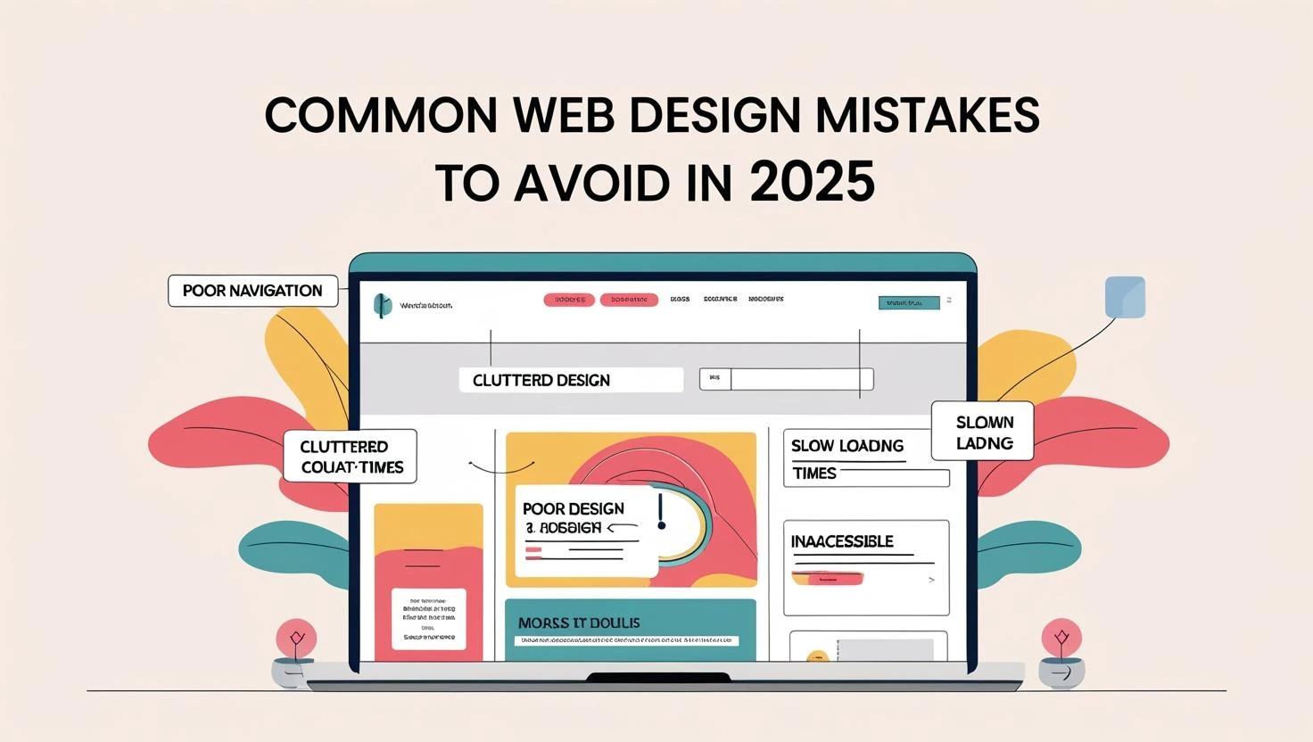
A business website does not fail because it lacks the newest effect. It usually fails because visitors cannot quickly understand the offer, trust the business, or figure out what to do next.
The opening message is too vague
“Quality solutions for every need” could describe almost any company. Your first screen should say what you do, who you help, and where you work when location matters.
Clear language makes a stronger first impression than clever language that leaves people guessing.
The site is difficult to use on a phone
Buttons should be easy to tap, text should be comfortable to read, and forms should not require unnecessary fields. Test the full customer path on a real phone, including the menu and contact form.
Pages load too slowly
Large images, heavy videos, too many add-ons, and poor hosting can make a site feel slow. Compress media, load only what the page needs, and avoid decorative effects that add more weight than value.
There is no obvious next step
Do not make visitors search for a way to contact you. Use a clear call to action such as “Request a quote,” “Book a consultation,” or “Call now.” Match the action to how your business actually works.
The website makes unsupported claims
Statements like “the best” or “number one” feel weak without proof. Real reviews, project examples, credentials, warranties, and specific process details are more convincing.
Important information is hidden
Customers often want to know your service area, starting price, timeline, or what happens next. You do not need to publish every detail, but answering the main questions can reduce low-quality inquiries and build trust.
The website was never updated after launch
Old dates, broken links, outdated services, and missing team members make a business look inactive. Review the site several times a year and whenever the business changes.
Design choices overpower the message
Animation, glass effects, and bold colors can create personality, but the content must remain easy to scan. Good design guides attention. It should not compete with the information a customer came to find.
Quick website review
- Can a new visitor explain what you offer after five seconds?
- Is the main contact action visible on a phone?
- Do real examples or reviews support your claims?
- Are your services and contact details current?
- Does every important page have a useful next step?
If several answers are no, a focused website redesign may help. You can also request a free website review to identify the highest-priority improvements.